CS 220
Developing a Social Media App to Promote Fitness for Students
ROLE
UX Designer
Timeline
Feb - Apr 2025
Team
Nivale B.
Gwen Y.
SKIlls
Contextual Inquiry
User Analysis
Usability Testing
TASK
Support athletics on campus
Design a mobile application that helps support Wellesley College students in the context of sporting events.
SOLUTION
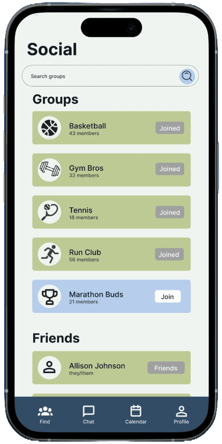
Lowering barriers through centralized, interest-based recreation
A low-pressure social and activity app designed to promote student well-being and physical activity at Wellesley that enables users to connect with like-minded peers through interest-based groups, messaging, events, and a shared calendar, all within one platform.
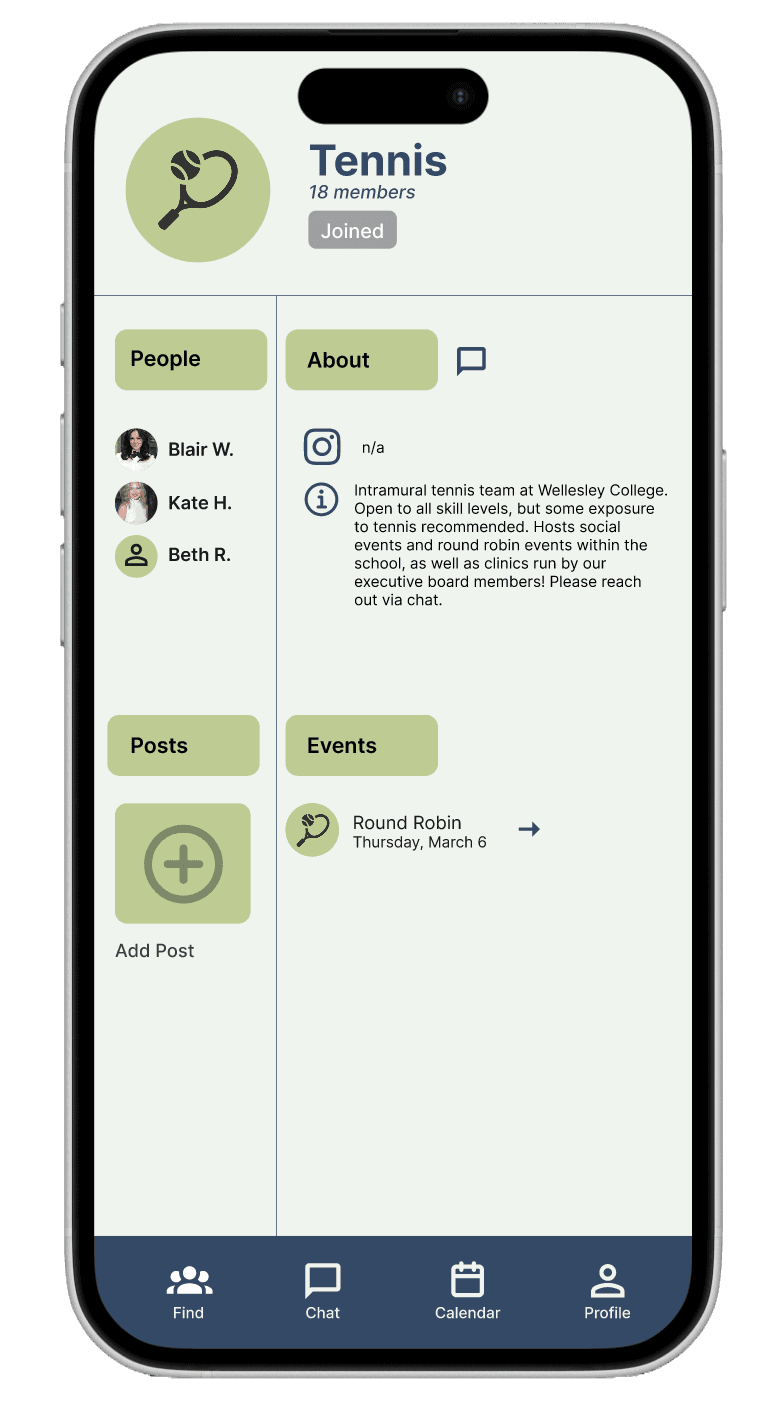
Join interest-based groups
Connect with peers around activities like pickup soccer, run club, or gym buddies.
Build a low-pressure social network to stay motivated and active.
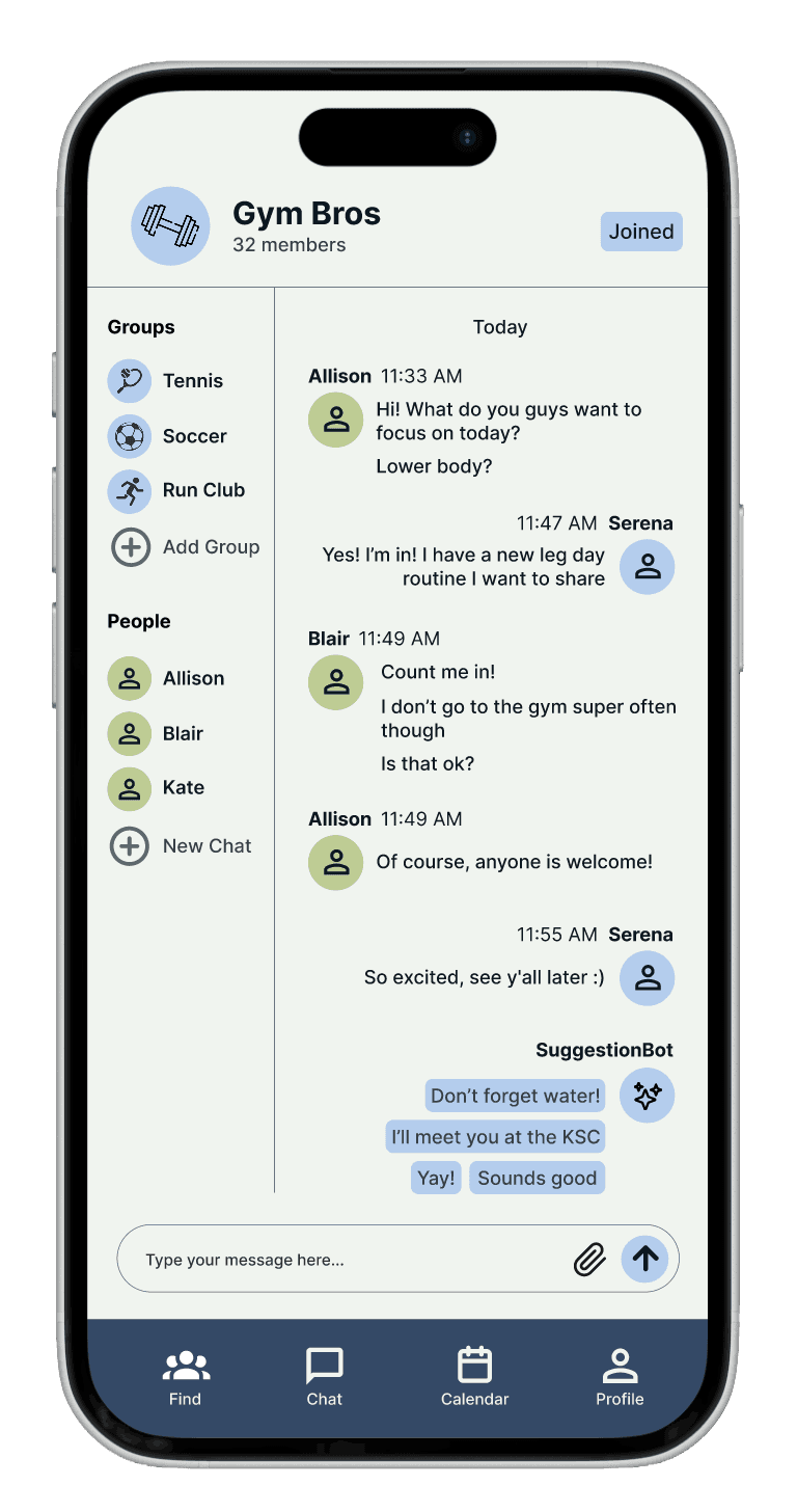
AI-assisted messaging
SuggestionBot offers prompts to reduce social friction and start conversations.
Makes chatting with groups or friends faster and more engaging.
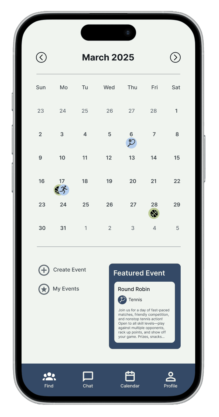
Create, discover, & track events
Quickly organize or join activities using structured event forms.
RSVPs automatically update your profile and shared calendar for easy tracking.
A centralized calendar highlights upcoming and featured events to encourage participation.
CONTEXTUAL INQUIRY
Investigating student attitudes towards campus sports
To begin, we conducted interviews to get a sense of how users felt about sporting events on campus, their general attitude towards physical activity, and things they would want to see in the future in this realm.
the main insight
Wellesley students need easier ways to connect through recreational physical activity
Through user analysis, we found that there was low general morale to attend games, so we widened our target audience to not just sports fans, but also those interested in simply getting active at Wellesley.
"I feel like a larger, more broader app where people could communicate on different channels would be more beneficial."
design artifacts
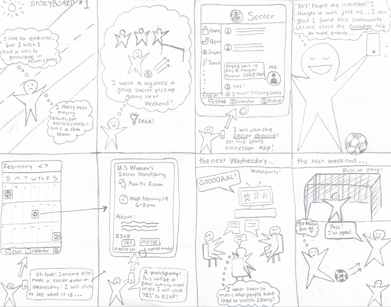
User personas & storyboards

Serena Vandal: Age 19, college freshman, introverted, loves the outdoors, meticulous, and looking for a community at school
Blake Kimmel: Age 21, college junior, former athlete, loves making friends, disorganized, and misses playing a sport

prototyping & testing
Refining our design direction
We began prototyping knowing that we wanted students to be able to join interest-based activity communities, have profiles, and a shared calendar to help users find like-minded peers and organize recreational activities.
Preliminary interface designs
Based on feedback users preferred design #1 (left image) design #2 (right image), which felt too similar to dating apps. We refined this direction by supporting smaller group chats, improving event management, and emphasizing quick scheduling tools to encourage participation.
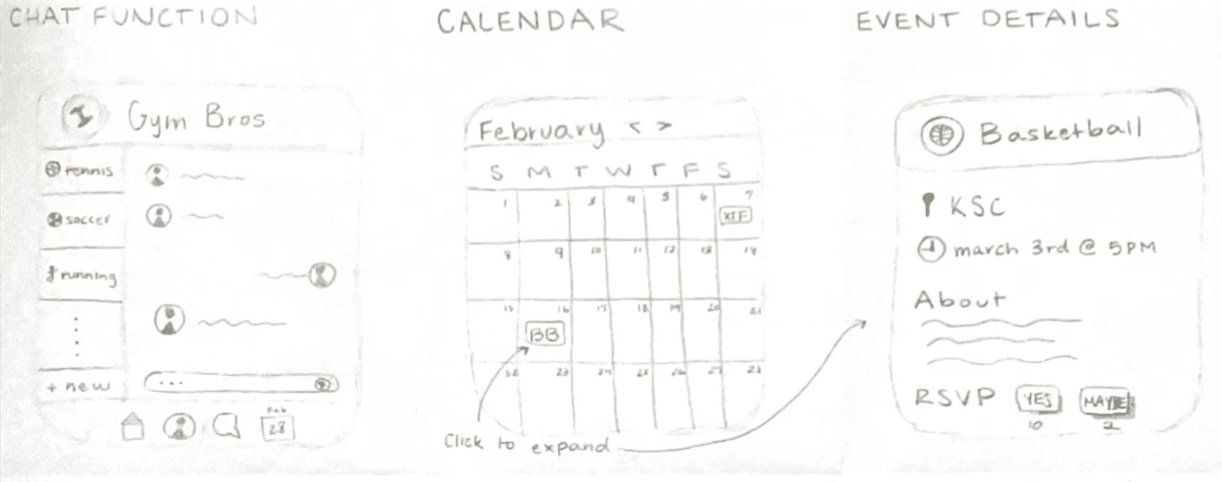
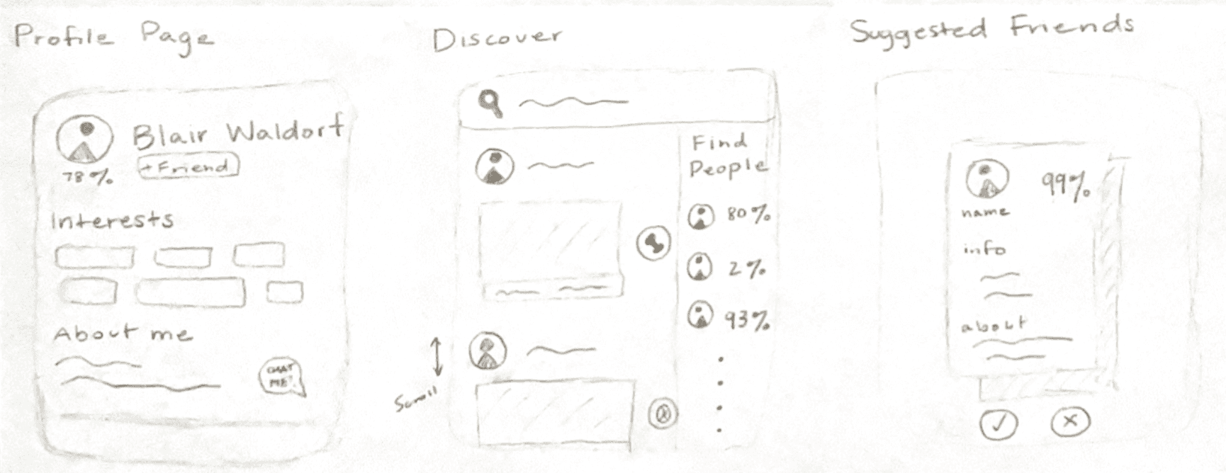
Lo-fi wireframe
Through usability testing, we found that we needed to clarify actions and labels, improve calendar visibility, and simplify event posting features.
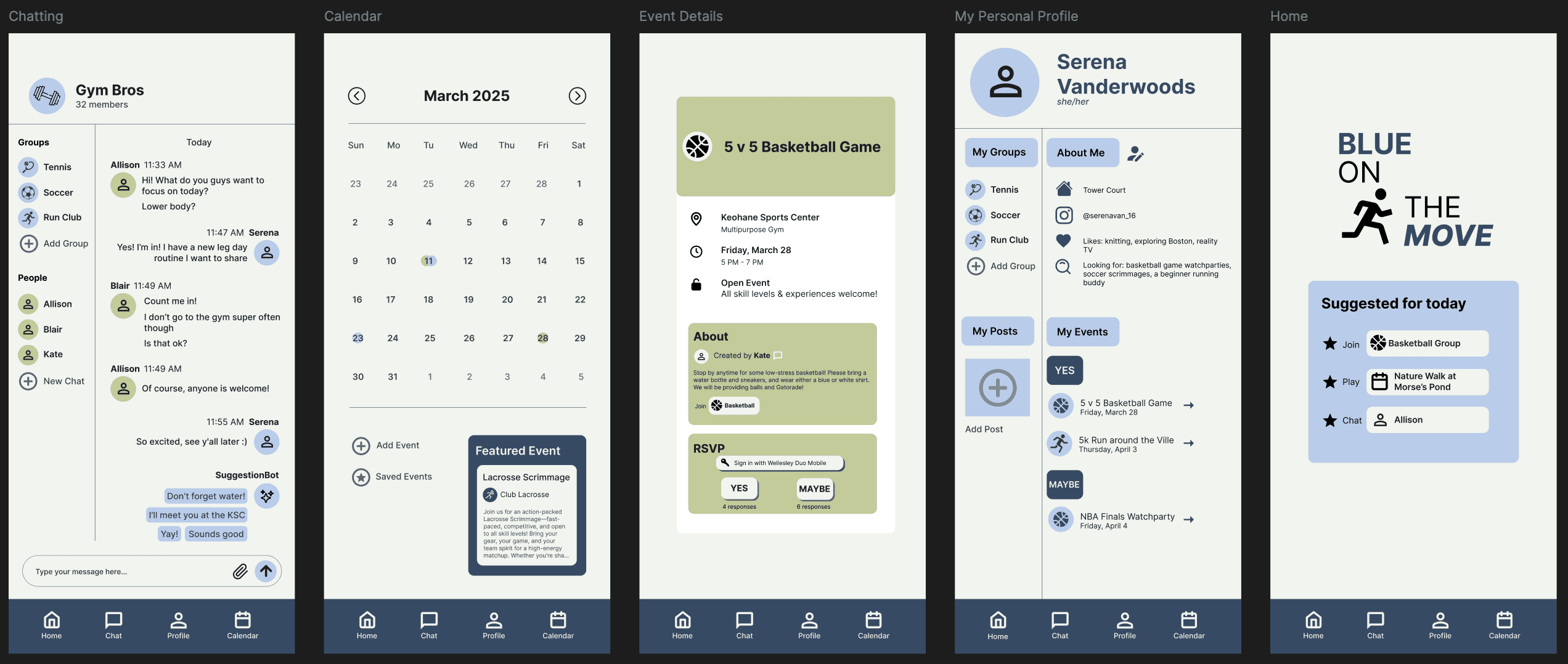
final screens
The final product
View the prototype on Figma here.
reflections
Future steps
To determine the success of the design even further, it would be of value to test usability giving a greater array of tasks for users to complete. The app has very wide functionality, as it is meant to be a hub for all things related to recreational sports at Wellesley, and in the second round of evaluation the three tasks we gave did not give users the opportunity to fully travel to all screens of our prototype. Another potential future step to determine the success of our design idea would be to get feedback from experts in user interface and experience design (heuristic evaluation) for a different perspective on what improvements can be made.