elements connect
Redesigning the Homepage for EC Staffing

ROLE
UX/UI Intern
Timeline
Jun - Aug 2025
Team
Solo Project
(Mentor Feedback)
SKIlls
Product Design
User Research
Prototyping
Problem
Users land on a homepage that has no meaningful purpose
Managing a workforce is complex. EC Staffing’s goal is to make that easier. But the homepage doesn't help users achieve that goal. Users only see a bare-bones calendar that doesn’t guide decisions, highlight urgent tasks, or enable them to act efficiently.
…What if the homepage actually supported workflows?
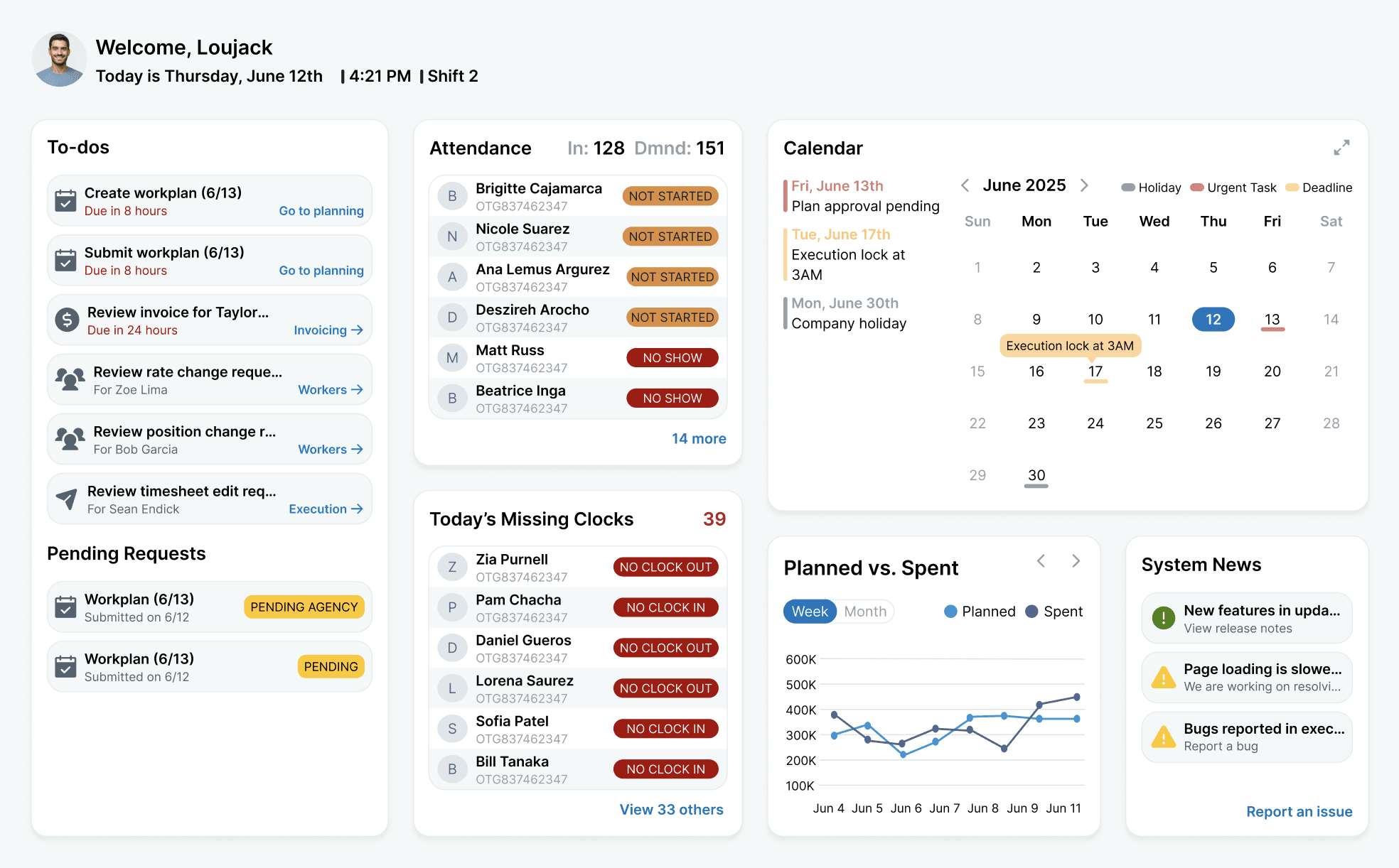
SOLUTION
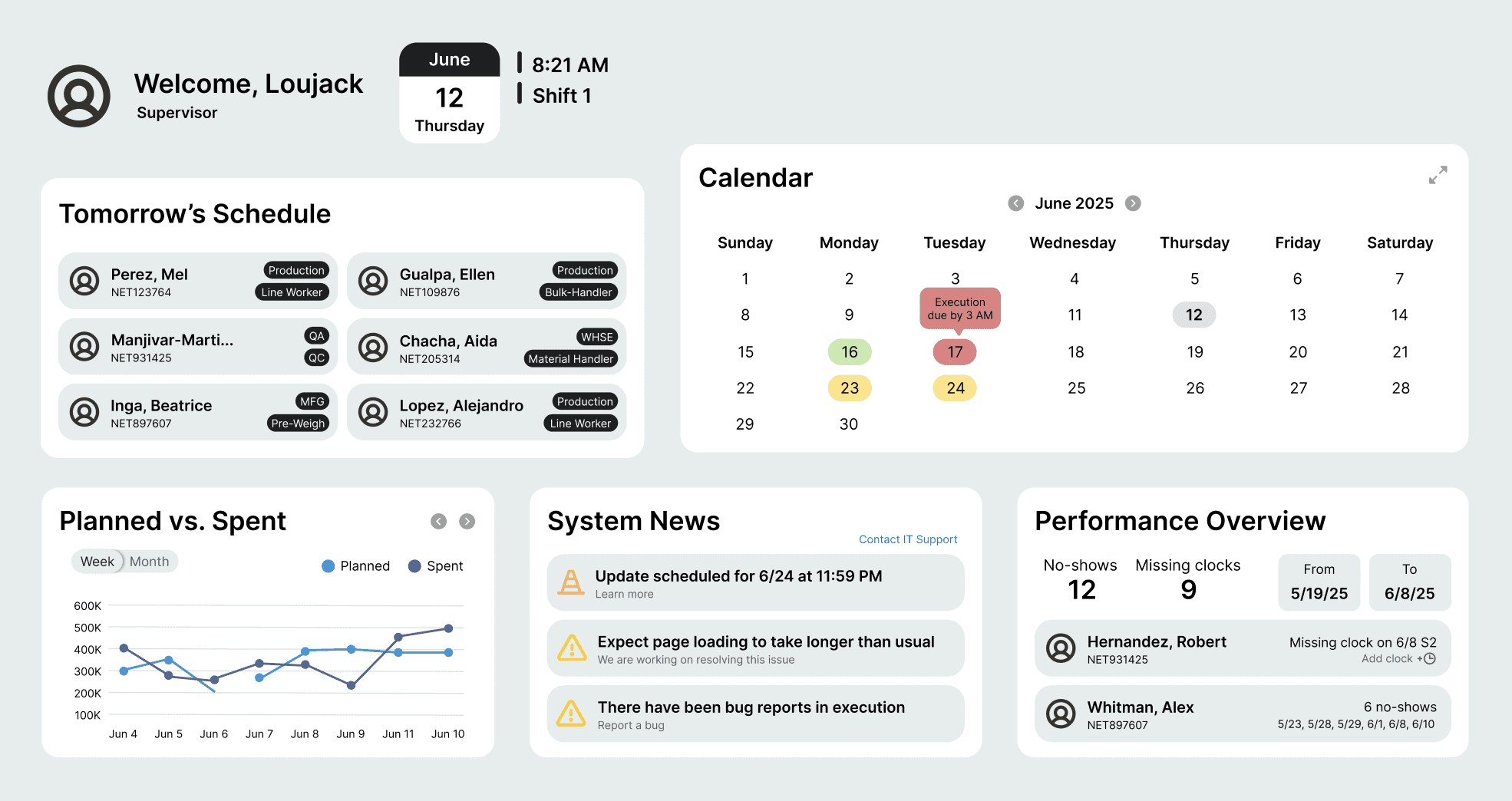
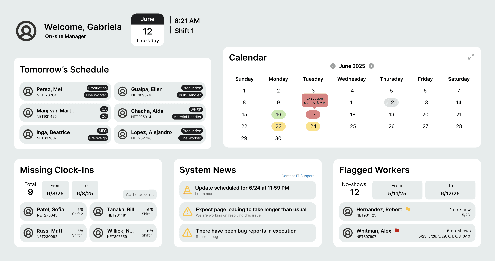
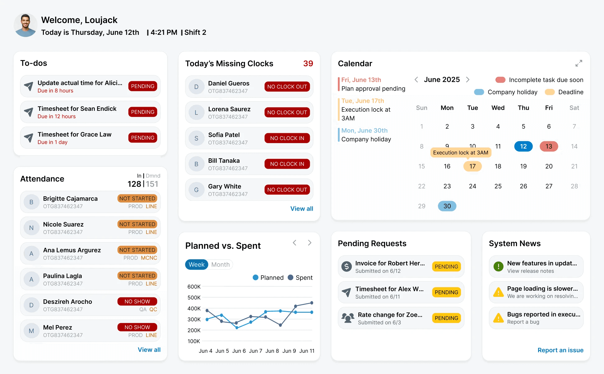
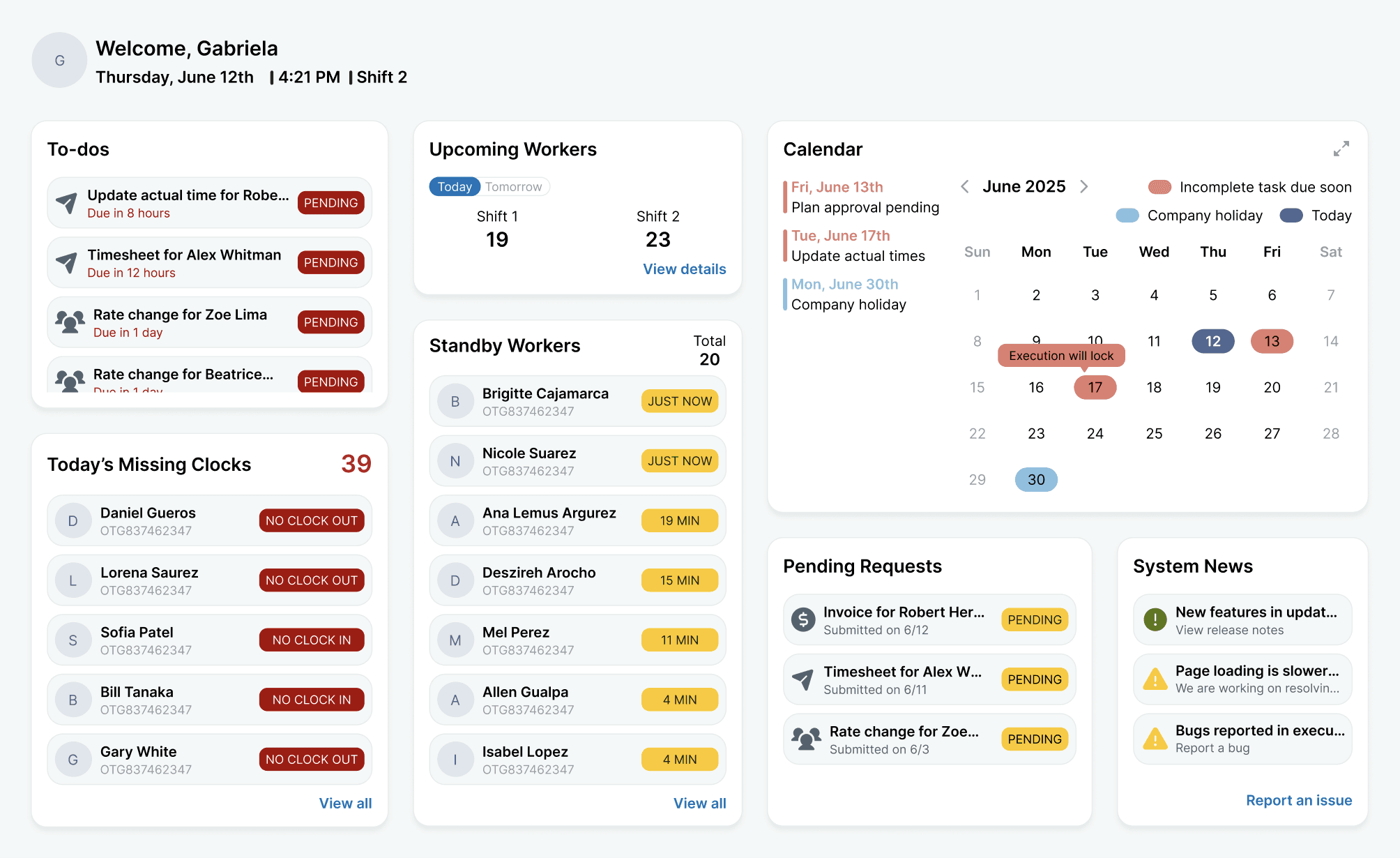
An action-oriented dashboard
The redesign transforms the space into a guided, informative dashboard that surfaces what matters most the moment users log in.
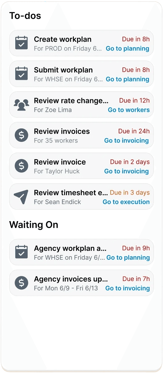
Immediate clarity
Users instantly understand what needs attention
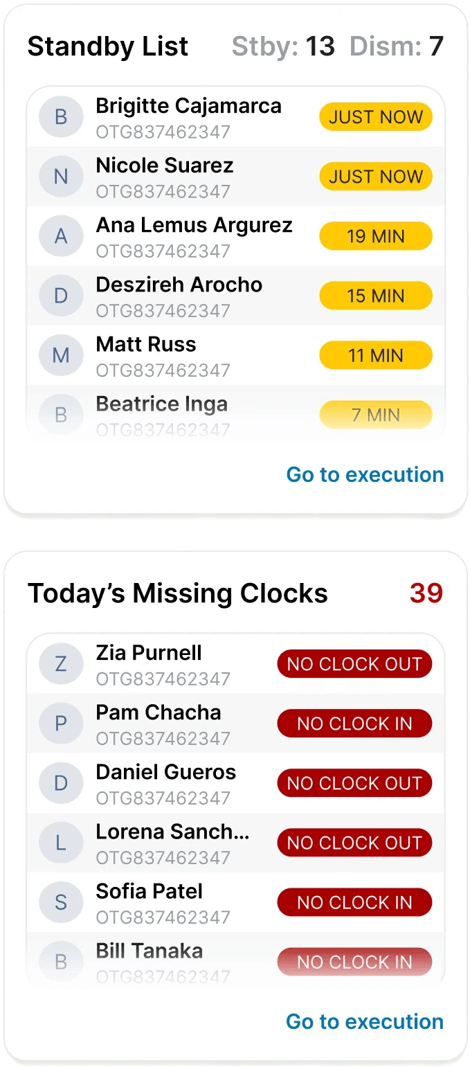
Real-time insights
View worker's attendance, missing clock-ins, etc
Quick actions
Common actions are surfaced where users already are
Competitive analysis
Homepages on other platforms show the path forward—EC Staffing’s didn’t.
I looked at popular workforce & operations platforms and found that in comparison, EC Staffing's homepage surfaced zero actionable information.
user interviews
What specifically is important for users to see & do?
Now that I knew what made a homepage effective, I wanted to understand exactly what information and actions users expect to see the moment they log in. I spoke with supervisors and agency managers about their workflow, asking:
What information is most time-sensitive for you during a shift?
When logging into EC Staffing, what is the first thing you do?
How do you currently stay informed on any updates, needed approvals, or alerts?
Tell me about any information or actions that would make your workflow smoother to see as soon as you log in.
the main insight
Users need quick visibility into approvals, shift issues, system updates, worker activity, and important metrics.
Through affinity mapping, I organized & grouped user problems found from my interviews into different categories:
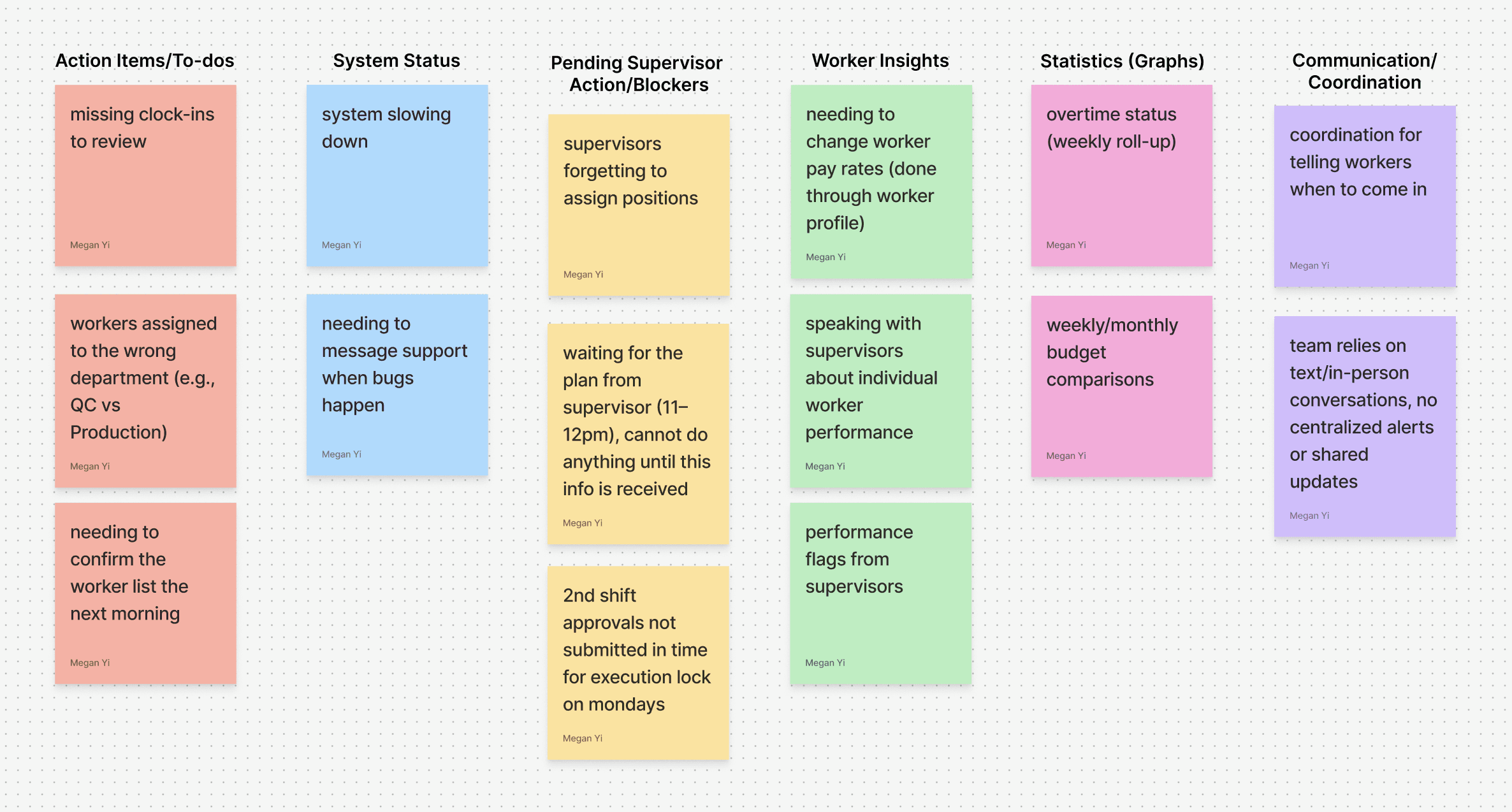
For the theme of communication/coordination, I thought that it would best be solved by a messaging and notification system. However, after receiving feedback it was decided this was outside the scope of the dev team. Therefore, I pivoted to an improved calendar to solve the root problem—alignment—without needing additional engineering effort. I then moved forward with 6 different themes.
Action items
My interviewees expressed that urgent tasks could fall through the cracks due to a lack of localization.
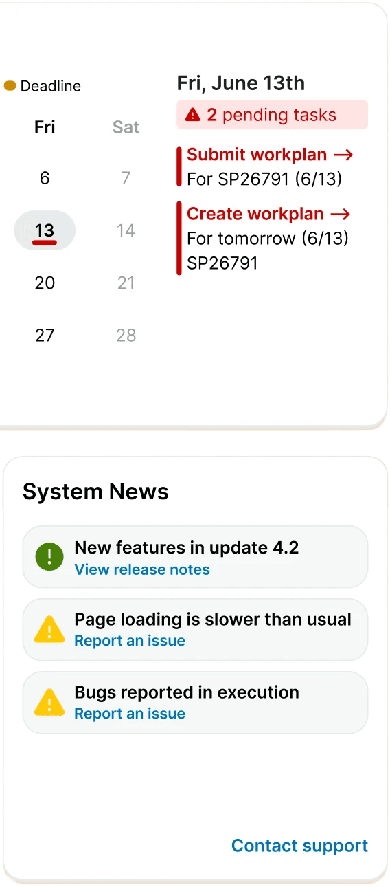
System maintenance
Being able to report any issues and being notified of anything system related.
Blockers
Users found gaps in their workflow when not being able to see items that were awaiting outside approval.
Worker insights
Wanting to easily taking action on information relating to workers.
Statistics & trends
A glance into different graphs like overtime, budgets, and any other relevant information.
Calendar
Highlight meaningful dates & deadlines to help stay coordinated and on track.
prototyping & testing
A widget-like dashboard for clear visualization & action
With clear categories established, a widget-based layout emerged as the most natural fit given the density and variety of information. This structure created an intuitive visual hierarchy that would prioritize tasks and guide user flow. I explored:
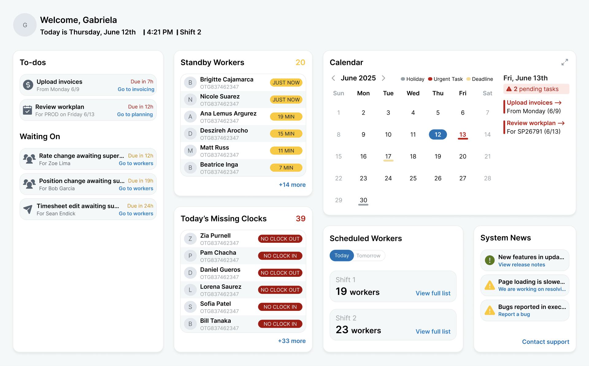
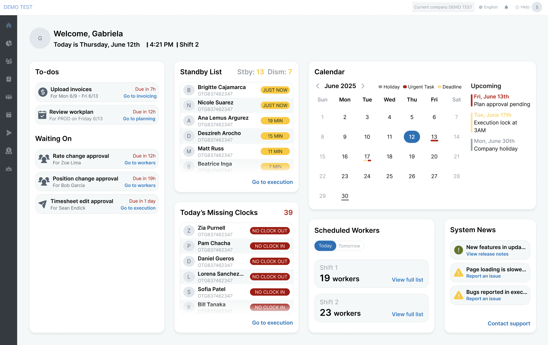
Supervisor vs. agency view
After testing a mockup of a singular point of view to a supervisor and agency manager, it became clear that their needs were slightly different, therefore I created two different screens tailored to each role.
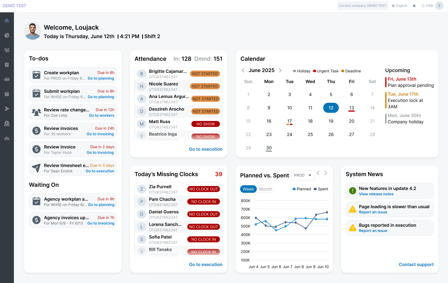
Multiple layouts
Playing with widget size and order for best informational hierarchy.
Tags, buttons & UX writing
Designing different buttons, tag coloring, and wording.
reflections
What I learned
Through this project, I was able to deepen technical skills like Figma proficiency (auto-layout, variants, components) and using design systems. Additionally, I learned how to think more strategically as a designer by by connecting user needs, business goals, and technical constraints into a more thoughtful design process. If given more time, I would've wanted to implement widget customization so users could have full personalization on what shows up on their dashboard.